Context
This project was developed as the final challenge of the UI Boost course, with the objective of applying UX and UI fundamentals to a conceptual digital interface.
In addition to usability principles, the project required strict adherence to the brand guidelines provided, ensuring visual and tonal consistency between the interface and the brand identity.
Design Approach
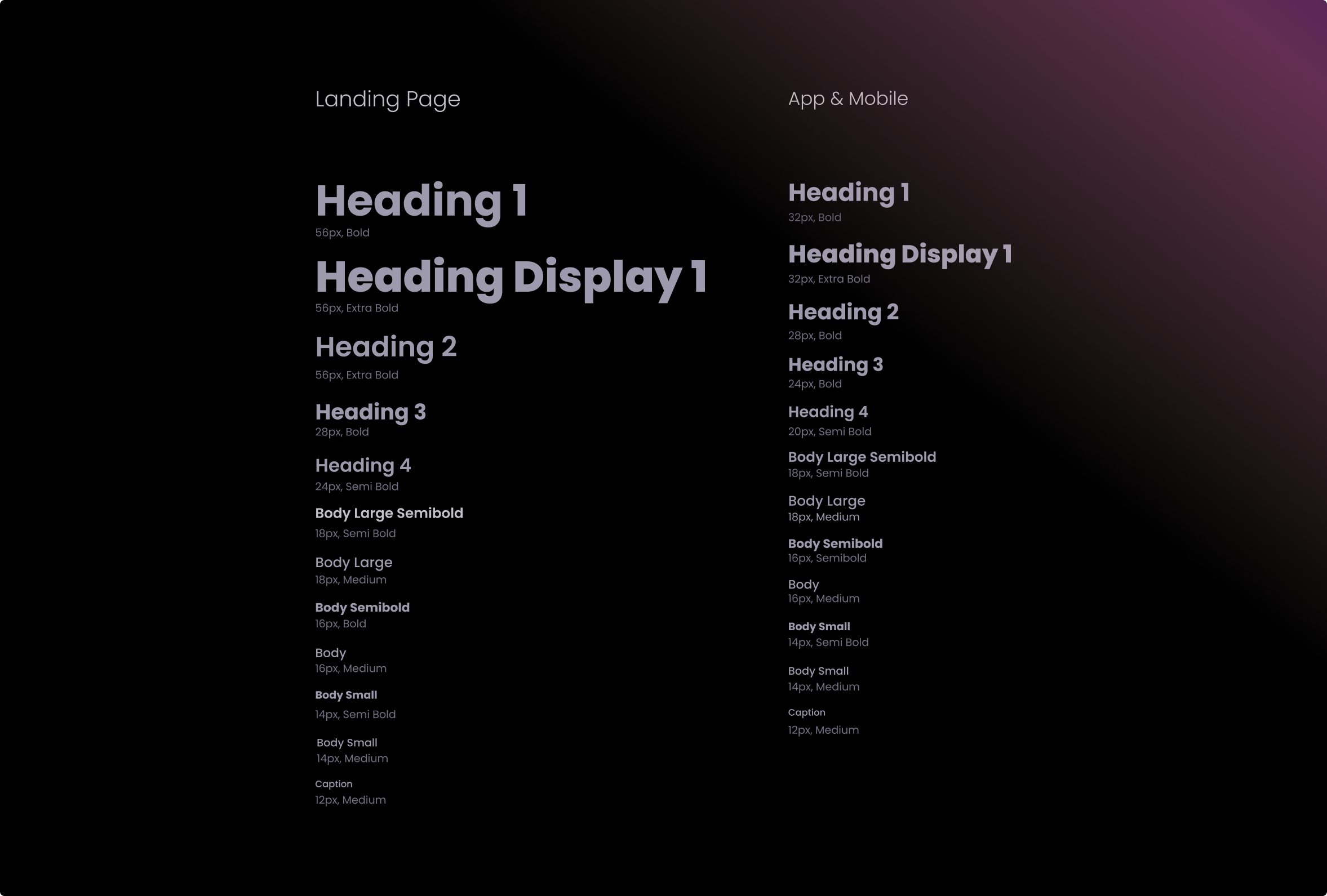
The design approach focused on applying UX fundamentals while translating the brand guidelines into interface decisions.
Rather than using branding elements decoratively, the goal was to ensure that typography, color, spacing, and component behavior reinforced the brand’s visual identity and values, without compromising usability.
Key Design Decisions
Key design decisions were driven by a balance between usability and brand consistency:
- Applying the brand’s color palette to establish visual hierarchy
- Using brand typography to improve readability and recognition
- Respecting spacing and layout principles defined in the brand manual
- Ensuring that UI components aligned with the brand’s tone and visual language

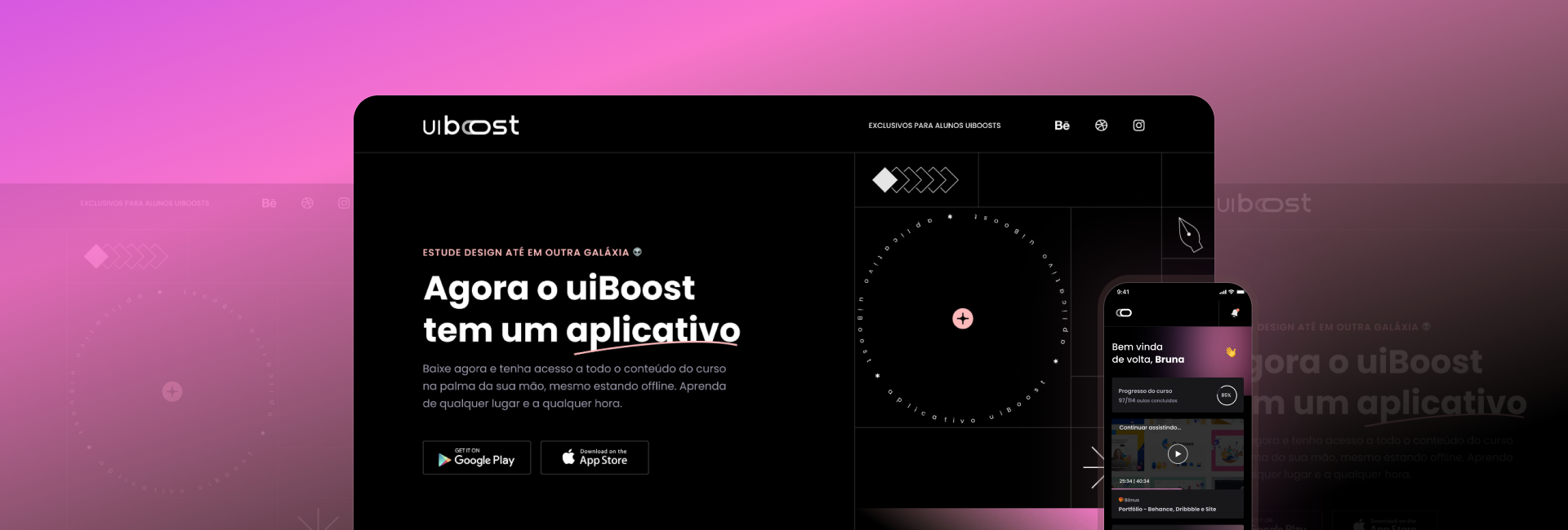
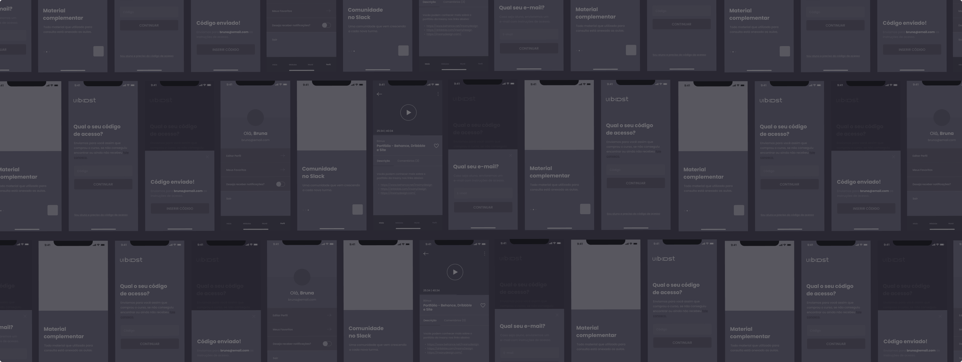
Interface Design
The final interface reflects a cohesive translation of the brand identity into a digital product.
All UI elements were designed to remain consistent with the brand manual, while still prioritizing clarity, accessibility, and usability best practices.
App

Landing Page

Final Outcome
The result is a cohesive interface concept that demonstrates:
- Strong understanding of UX/UI fundamentals
- Ability to design within brand constraints
- Clear translation of brand identity into a functional interface
Check the Prototype in 🇧🇷 pt-BR